All case studies
Independent · 2025 – 2026
comp-lib
A design system built to be operated by coding agents as much as by people.
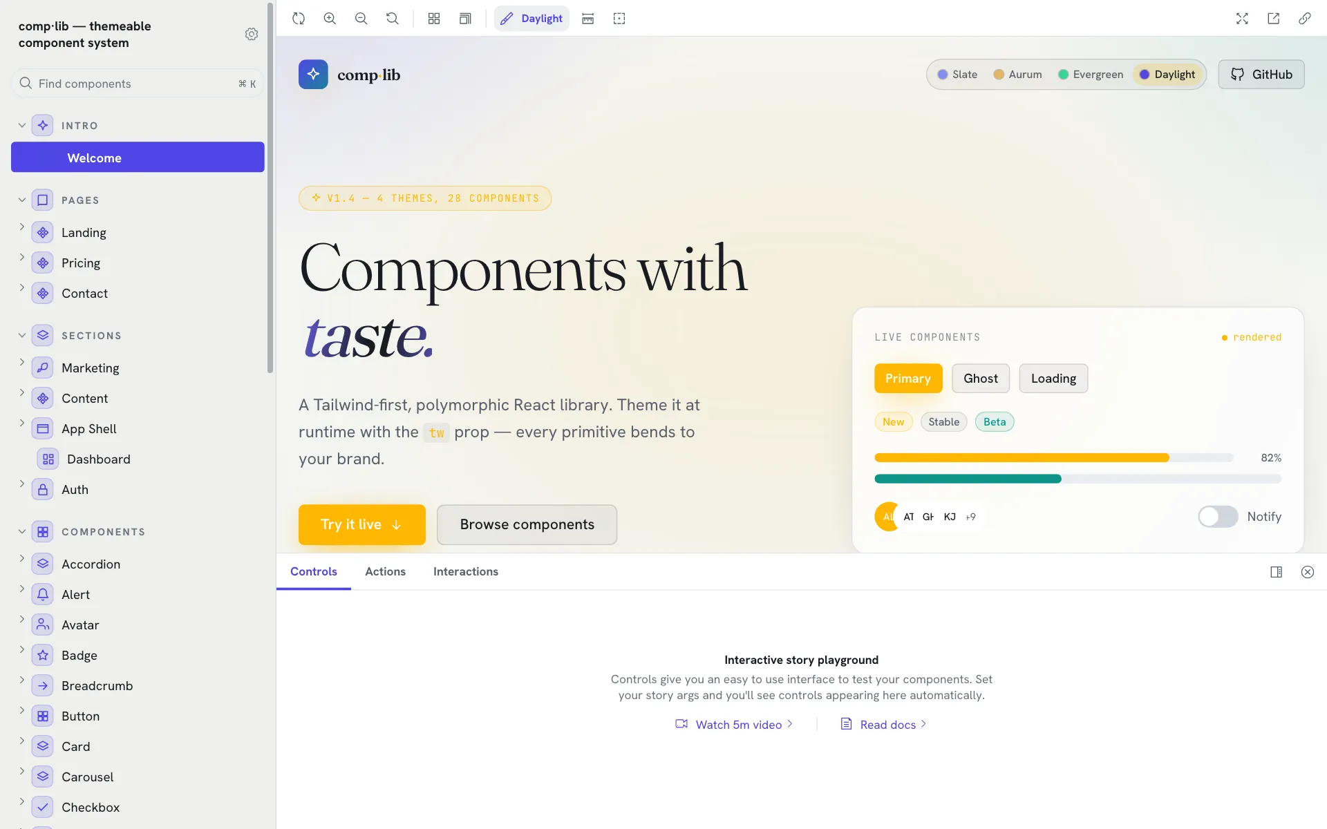
40+accessible components and primitives, with 24 section blocks and four runtime themes.
The project
A Tailwind-first, variant-driven, polymorphic React component library with a runtime-themeable design system and an interactive Storybook.
- Role
- Design and build · independent
- Stack
- React
- TypeScript
- Tailwind
- Storybook
- tailwind-merge
The problem
Most component libraries are written for people reading docs. Coding agents now write much of the UI, and they need the API surface as data, not prose.
What I did
- A `tv()` variant engine for composable, type-safe variants, with polymorphic `as` and conflict-aware `tw` props.
- Four runtime themes driven by CSS-variable tokens: re-skin the whole system by setting `data-theme` on a root element.
- Agent-operable by design: an `llms.txt` index, a `registry.json` of every component’s variants and props generated from source, an `AGENTS.md` contract, and a static `__meta` on each component for runtime introspection.
- SSR-safe hooks, tree-shakable named exports and WCAG 2.1 AA keyboard and focus behaviour throughout.
What changed
A full system rather than a demo: forty-plus components and primitives, a 24-block section tier and copy-ready page templates, documented for both humans and agents.